|
This picture is the short story of how I designed the cover for Rook and Shadow...
Keep reading for the much longer version.
First Design: Birds and FeathersI worked on Rook and Shadow for about ten years. Somewhere along the way, cover design became part of my writing process. Maybe it's just my way of procrastinating. But maybe not, because I’m as susceptible to Facebook browsing and YouTube videos as the next person. (Why struggle through the next chapter when it's so much easier to Facebook stalk high school classmates or watch people you don’t know discuss movies you haven’t seen?) Since writing Rook and Shadow took over ten years, I spent a lot of time thinking about the cover. I designed my first covers in high school. My original idea was to have a bird on it. Because: Rook. Also, the book is about running away and finding freedom. What’s more free than a bird soaring in the sky? My intended color scheme was the gorgeous blue/purple/green tint that rook feathers have. This was a bad idea. Impossible to execute with my resources. For one thing, I needed a picture of a rook-like bird in flight. I pulled to the side of the highway more than once because I saw a likely bird flying overhead. I kept my camera on my front seat so I would be ready. I studied drawings of wing structures to get the photos at the right angle. I really wished I could draw myself. Turns out, it is really hard to get a good picture of a bird in flight. Harder still to make it work as a larger part of the cover. I wanted it to seem like you were looking out the window at the bird. I like the picture, but it doesn't really work as a cover. And that dark rainbow of blue/purple/green? Impossible to capture. I’ve searched professional stock photo sites since then and still haven’t found anything that comes close to what you see in real life. My plan was to create a wing to use as a frame for the text. Here's some of my first covers and the pictures I used to make them. Second Design: Shadows and Light
My next ideas were more conceptual. The book plays with identity and shadows and light, so I decided to use silhouettes and black and white. I kept the bird around for some of them, manipulating the faces so they formed the shape of a bird in flight. I still like this idea. I loved the design until I saw it printed on a paperback. It looked awful in person. The black and white didn't look conceptual and artsy in print. It looked cheap. So I scrapped the whole concept and started over.
I worked on these while in graduate school. Salara’s face is a modified version of mine. For Shadow’s face, I traced pictures of celebrities I found online. I needed someone with a strong nose and chin. Any guesses whose face I used? Third Design: Stock Photos
By this point, I had realized I was not a professional cover designer and needed help. I was also a broke graduate student working two jobs to pay for school. So I searched Deviant Art and Shutterstock, hoping to find something cheap or someone willing to collaborate for shared glory.
I fell in love with this painting on Deviant Art. It has a darker tone than Rook and Shadow. There are several things that don’t quite fit the story, like the woman holding a bow. But isn’t it gorgeous? 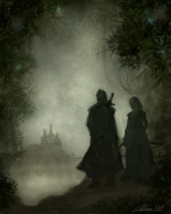
Fairy Tale by Hakubaikou
It also has a tragic back story. I tried to contact the artist, but she had died in a car crash. Her brother posted an article asking people to respect his sister's work. They were art, not stock photos. I agreed with him about their being art, but I could only afford stock photo prices. I would also need to crop and edit the image, which he forbid in his post. I didn't want to add to his grief. So I left him alone and gave up on this being my cover.
Fourth Design: Girl/Castle
Lacking further options, I did some market research and looked up covers past and present for similar books. I focused most of my research on Shannon Hale and Gail Carson Levine since they write in a similar style. (If you're interested in cover art, scroll through Shannon Hale's books to see all the international covers for Princess Academy. Gorgeous!)
For a publishing nerd like me, analyzing these trends was fascinating. I bought a few different editions of Ella Enchanted to compare art styles. Most of the current books and redesigns of older books had illustrated covers. Not good for me. I’m a photographer, but I can’t draw. So I ignored the fact that most covers were illustrated and focused on the content. I realized there were two major trends in cover design: Girl/Castle and Fabulous Dress.
Girl/Castle has a girl in the foreground and a castle in the background. Fabulous Dress has a muted background and shows some of the girl's face, but the focus is the dress.
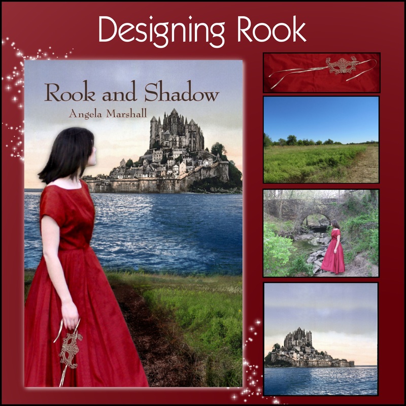
Salara wears some fabulous dresses in the book, but I didn’t have the resources to make a Lady Alma level designer gown. Plus, Salara’s running away from all that. It seemed unfair to show her as the person she was trying not to be. So I decided on Girl/Castle. It was a simple composition that hopefully showed the genre and target audience of my book. Unlike the iridescent blue/green/purple rook feathers, I could actually create it. I just needed a girl and a castle. The Girl
This part was easy enough. In college, my friend Whitney and I worked together as theater costumers and did photo shoots in our spare time. One such photo shoot was for cover images for my latest draft of Rook and Shadow. I'd had these pictures for years at this point.
Whitney still sews and does cosplay and craft tutorials. Check out her website. Or YouTube channel.
Whitney makes a beautiful Princess Salara, and I’d had these images in my head while writing the book. Picking one was difficult. I wanted her face to be at least partially hidden. I wanted movement in the skirt and pose. I tried to keep the background because I think its a pretty setting, but ultimately had to get rid of it to make way for the castle.
The Castle
I tried to use images of local architecture I already had, but they didn't work. I had pictures of real castles from a recent trip to Europe, but they weren’t right either. I needed a castle on a mountain by the ocean. All the castles I had visited were landlocked.
But I knew such a place existed. The original inspiration for Castlemont came from a picture I saw in a list of “20 Beautiful Castles You Won’t Believe Exist” or some such article. I didn’t have the link, but with some searching I found the castle. Which is actually a monastery. Mont Saint-Michel in Normandy, France. 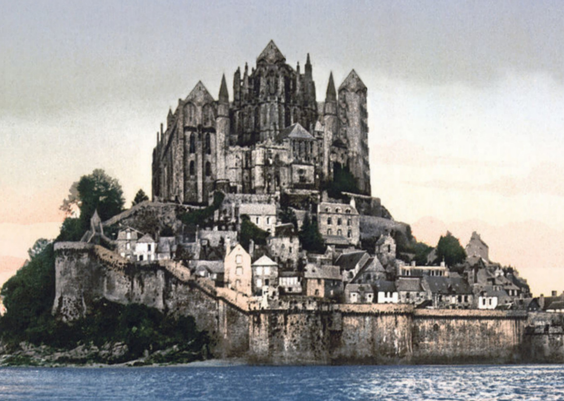
More searching produced a public domain picture I could use. I had my girl and castle!
Final Steps
I had to get rid of the background around Whitney. I darkened her hair, lightened her skin, and changed the color of the dress to make her fit the description in the book. I added extra towers to make Mont Saint-Michel look more like a fairy tale castle.
I needed something in the foreground for Whitney to stand on so she wasn’t floating in the ocean. I took a picture of a grassy field at a nearby park. There was a dried out patch (common for Oklahoma in the summer). I darkened that, so the ground looked burnt around her. This fits the plot of the book and added contrast so she stands out from the background. I also had to mirror the entire cover so Whitney wouldn't risk getting chopped off during the book production. 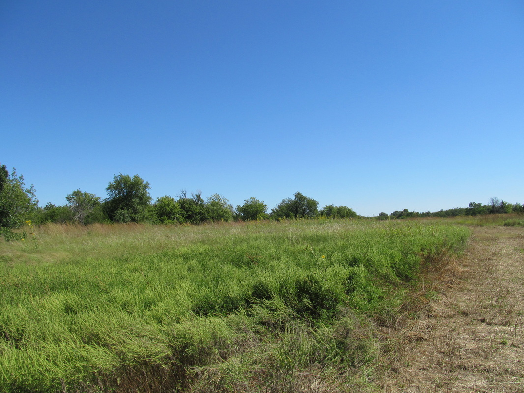
The Field
I decided to have her hold something to add more drama. There was a masquerade scene, and masks fit the identity and disguise themes in the book. I have masks in my costume collection, so I had options. I chose a silver lace mask I bought in Venice and photoshopped it into her hand. This was tricky. I had to replace her hand with a different one from the Whitney photo shoot to make it look natural. 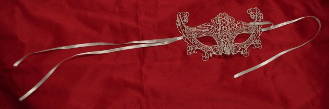
I added the title and my name, and the front was done! The back cover and spine are another story. (Less epic, but still a story.)
Given how horrible my silhouette cover looked on a paperback, I was nervous. But the final design didn’t disappoint. 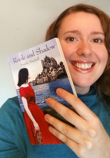
Can I tell you how exciting it was to see this in print after so many years of work?
Probably not. But there was quite a bit of undignified dancing around the house after I opened the box. And some shouting. And then more dancing.
2 Comments
Sandy
2/6/2016 07:20:35 pm
Wow! Quite a journey. Love how you showed the photos and how you put them together. And I love Rook and Shadow. Leave a Reply. |

A. G. MarshallBonus scenes, glimpses into my writing process, and more! Recent PostsArchives
July 2022
Categories
All
Join my newsletter to get new release updates and free bonus content!
|


 RSS Feed